Related Articles
- Navigating Ethical Travel: The Role of Arts and Crafts in Supporting Local Economies and Cultures
- Rediscovering Ancestral Routes: How Ancient Trails Offer Insights into Sustainable Travel Practices
- The Ethical Dilemma of Luxury Travel: Splurging or Supporting Sustainable Development?
- Navigating Ethical Dilemmas: The Quest for Authenticity in Local Food Experiences While Traveling
- Beyond the Facade: Exploring the Subsurface Infrastructure of Iconic Historical Structures
- Curiosities Unearthed: The Surprising Connections Between Historic Sites and Modern Art Movements
9 Impactful Color Theory Techniques to Enhance Your Travel Photography for Vivid Cultural Storytelling
9 Impactful Color Theory Techniques to Enhance Your Travel Photography for Vivid Cultural Storytelling
9 Impactful Color Theory Techniques to Enhance Your Travel Photography for Vivid Cultural Storytelling
1. Understand the Color Wheel
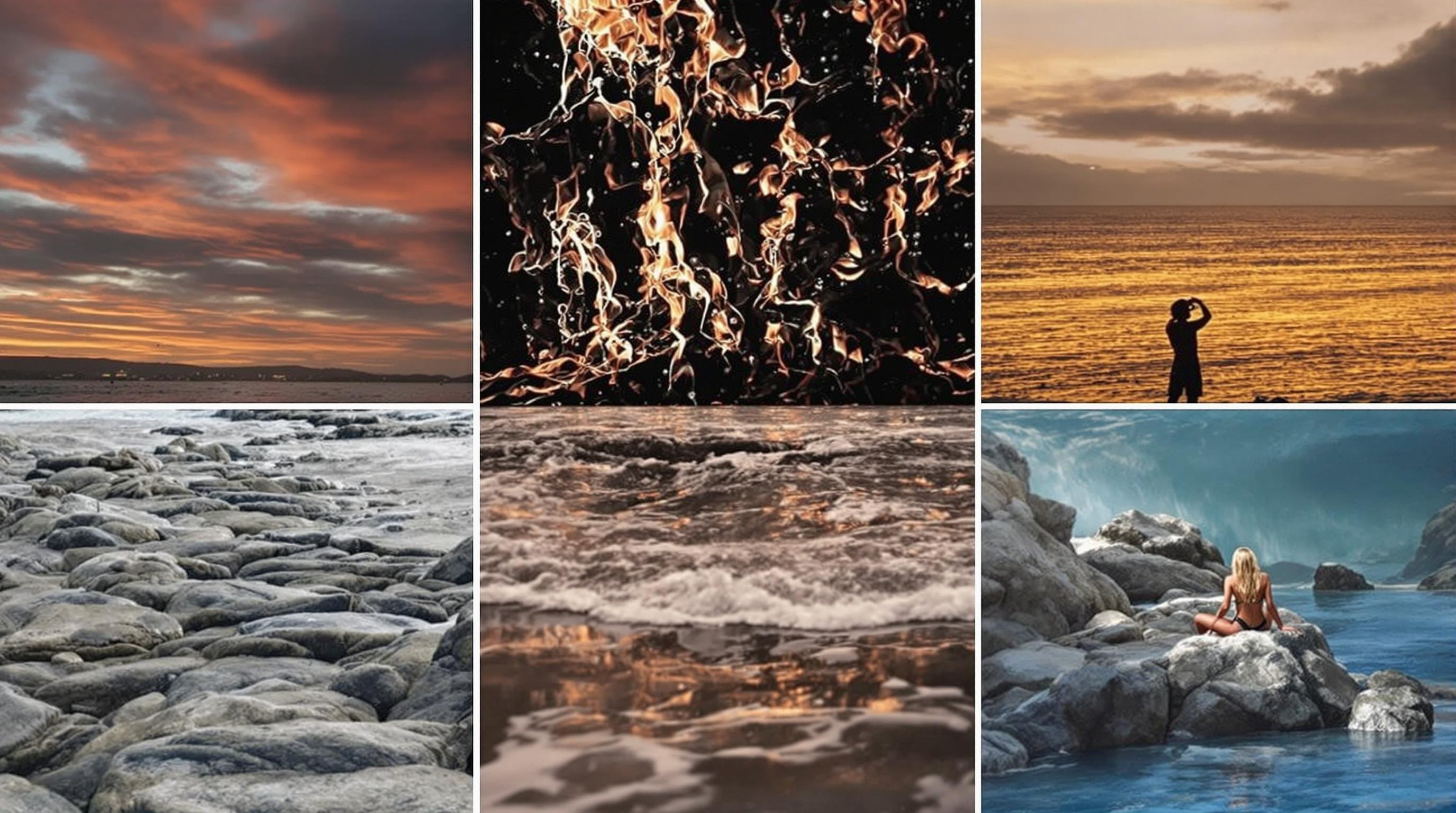
The color wheel is the foundation of color theory, illustrating the relationships between various hues. Familiarizing yourself with the primary, secondary, and tertiary colors helps in creating balanced compositions that evoke specific emotions. For travel photography, using complementary colors—those opposite each other on the wheel—can create a striking visual appeal, drawing viewers into your story.
Utilizing the color wheel effectively can add depth and context to your photographs. For example, capturing the vibrant blues and oranges of a sunset can illustrate the warmth of a tropical culture, while cooler tones may reflect the tranquility of a serene landscape. The choices made here are crucial in conveying the essence of the environment.
Resources such as "Color Theory for Digital Photographers" by John Batdorff offer invaluable insights into applying color theory effectively in your work, enhancing your ability to tell cultural stories through vibrant imagery.
2. Capture the Essence of Local Colors
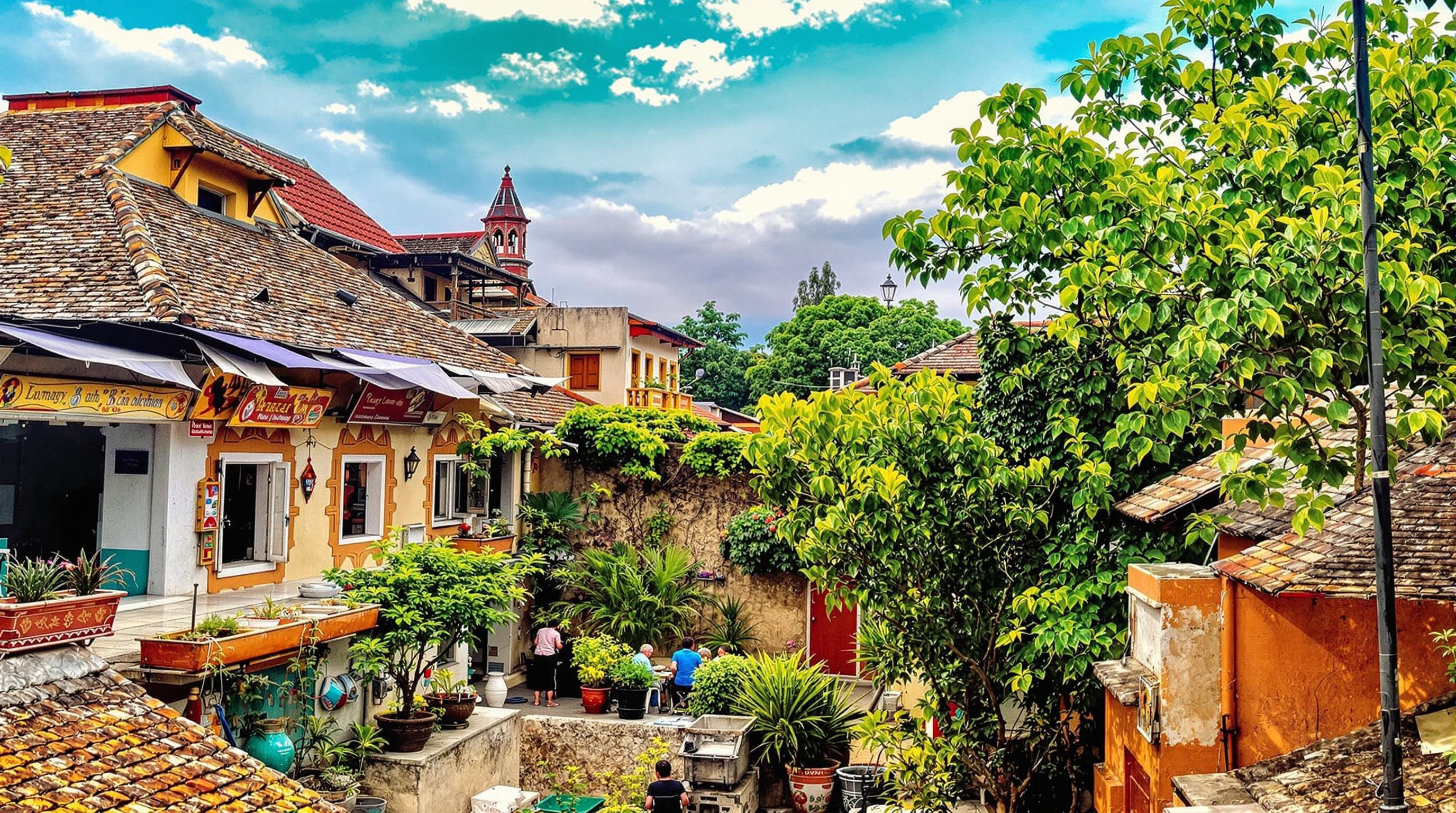
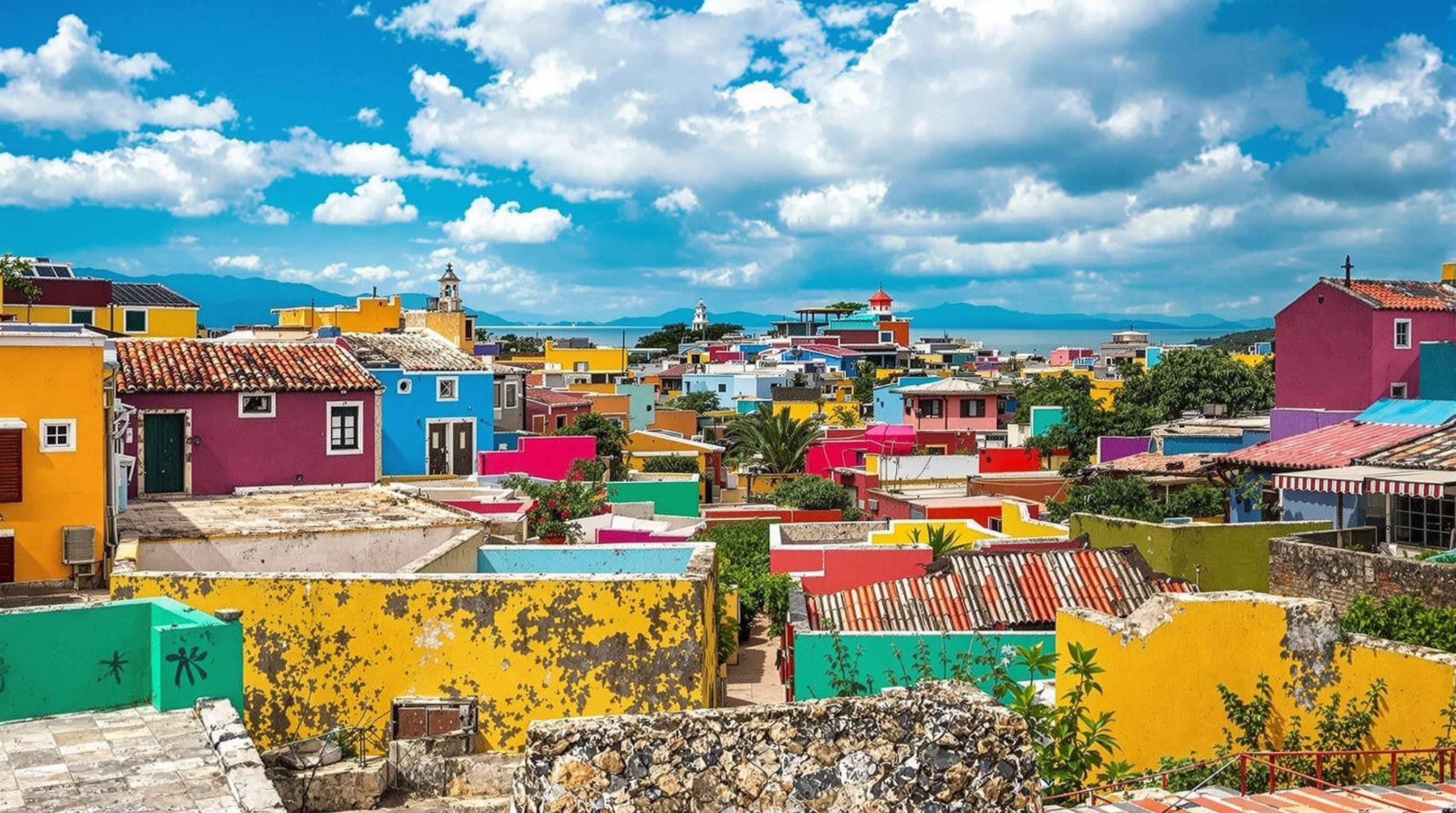
Each culture has its unique palette of colors, deeply rooted in local traditions and history. Paying attention to these colors when you travel will not only enrich your images but also provide a narrative layer that informs viewers about the location. Think of the deep reds and yellows of Indian spices or the blues of traditional Greek buildings—each hue can represent a rich cultural story.
When photographing a destination, try to identify and include these characteristic colors in your frames. Look for local textiles, architecture, food, and landscapes that showcase the distinctive colors of the place. This selection process can turn a simple travel photo into a vivid cultural tapestry.
As you incorporate these elements into your photographs, remember that you are not just documenting a scene but weaving a narrative thread that connects viewers to an experience. Resources like "The Photographer’s Guide to Color" by Richard V. Gentry can aid in identifying these color stories.
3. Utilize Color Contrast
Experimenting with light can enhance this contrast—a bright sunny day can amplify colors, while overcast skies can create a softer feel. Adapting to conditions and seeking out contrasting colors allows for expressive images that capture the viewer's attention effectively.
4. Monochromatic Schemes for Mood
5. Apply the Rule of Thirds with Color
6. Embrace Color Grading in Post-Processing
7. Use Lighting to Enhance Colors
8. Explore Cultural Symbolism of Colors
9. Tell a Story Through Color Juxtaposition
Read More